COLOR + DESIGN Week 3 Exercises

Blog Post Questions:

  1. Who is Joeseph Albers?
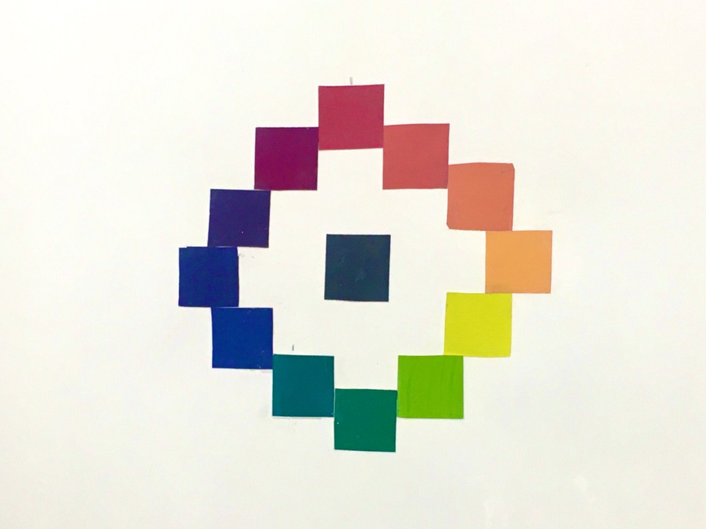
    1. Revolutionary artist who explains the relativity of color.
  2. What is his role in Color Theory?
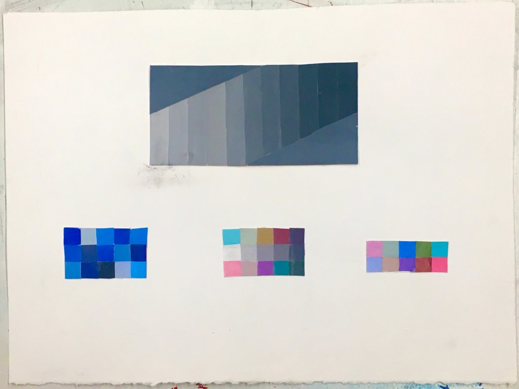
    1. He defies the traditional understanding of color theory and emphasizes the application and practice of color before theory. A theory itself does not lead to the production of art— people do. And only people can tell and differentiate whether two colors are the same in a composition. It’s hard for our eyes to identify two blocks of yellow for example, if one is placed in a sea of blue and the other a sea of orange. We’d imagine the orange bordered yellow as warmer or “less intense and harder to see” compared to the yellow coated in bold blue.
  3. What did you discover in the article about Albers?
    1. I realize I applied some of this thinking into my own art indirectly for a long while, but did not realize it was application of color theory. I thought “ok, this hot saturated pink looks nice with this very light and desaturated purple, so then the latter color in turn almost looks like a grey.” I didn’t know how to describe this process and this article reminds me there’s a term for it, called color theory.
  4. What did you discover by clicking the embedded links?
    1. A series of books that further analyze the actions of color.
“One Color Looks Like Two” Color Studies
“One Color Looks Like Two” Color Studies (2)
Transparency Study

Color + Design Week 2 Exercises

1.) Wolfgang Tillman Still Life Narrative

Someone really wanted to make a physics science project but could not access any conducting materials during a very threatening pandemic. Unfortunately stock of wires, cables, plants, batteries, and any electrical conducting materials imaginable have been wiped from common shoppingplace shelves. Mass toilet paper panic buyers sought wires as their next specific target for an unfortunate reason, and this person was out of luck. A dozen hours were spent researching “easy conductable materials to find at home,” and the following image is what they could find! Turns out oranges and rock-like, flaky materials can suspiciously transfer electricity using wires and string. Who knew ?

2.) Digital rendering color adjustments

New image
Original image

3.2 | Material Studies

Observation of line, shape, placement and shading juxtaposed to create an out of the box image of AirPods. They normally rest in the palms of someone’s hands, its lid briefly detaches and closes with the buds removed. But do people take time to observe its sculpture ? The AirPod case holds a basic shape, yet shadow creates various shapes if light coats an AirPod case at a specific angle.
Multiple sheets of drawn paper shown across a light to give illusory motion of stick figures running off a large hand.
The bristles of a modern brush are placed directly on a sheet of paper, and pencil runs across the paper while hitting bristles several times. This creates a textured line effect. The bristles of a modern brush are then placed on the back of paper and it’s circular outlines are traced.
Gesture of a hand directly in the mood to slam down a surface. Use of pink and black HEXAPLUS pens pull exaggerated fingers upwards to emphasize impact and the illusion of motion.

Found Motion Sketches — Monday 2/23 Wednesday 2/25

Monday 2/23. “Billowy, cloud like images inspired by Studio Trigger’s upcoming ‘BNA’ release” was a working title for this drawing. I imagine motion of clouds being thrown across a page like a set of smoking yoyo’s.
The motion of touch is admirable. I picture anticipation of putting my hands under a fountain. Water sliding through fingers into the ground. I picture all of these elements as part of motion, results after motion takes place. The slide of fur crawling under the cracks of my fingers until I can’t hold anymore. I want to hold a really long cat.

3/22 Mapping in Progress

https://www.flickr.com/photos/britishlibrary/11005174884/

This image holds a strong atmospheric perspective through its largest detail in tone/shading of every shape. The image creates the illusion of depth by adding a light, stippling like shade of gray in the topmost area of the image, and allowing its closest areas to have much darker values in a brown shade scale. Forest trees dominate the upper half of the image followed by a very light (illusion of white) waterfall, leading the eye to a human figure much smaller in scale to the rocks surrounding them. The closest rightmost rock has a strong dark shade which implies closeness, because of the shadow made or “created” by the main light focus being shifted towards the left. On top of bits of reflective light made through an illusion on that rightmost rock. It is created by adding very faintly lighter shades of brownish green along the rock. Strong atmospheric perspective and scale shift.

https://www.getty.edu/art/collection/objects/189/giovanni-battista-piazzetta-a-boy-holding-a-pear-giacomo-piazzetta-italian-about-1737/

This boy’s head consumes a minimum 1/3 of the page. An enjoyable use of transparency manifests on the boy’s cheek to mimic reflecting light. Vertical location strongly presents on the boy’s grape holding hand, whose white lines fluidly dance to the centermost area.

https://www.rijksmuseum.nl/nl/rijksstudio/kunstwerken/schilderijen/objecten#/SK-C-229,1

Repetition of brown greyish colors add homely effects to the otherwise bustling effect of this family painting. My eyes immediately consume colors through guidance of flailing family arms across the piece. Each family limb holds or presses an object in some way that elicits anticipation. A man merrily holds a glass of water (?) with the anticipation to drink, and the rightmost kid’s leg extracts fear of him accidentally slipping off the table from lack of balance

https://www.getty.edu/art/collection/objects/255162/ludolf-backhuyzen-a-battle-at-sea-dutch-1692/

This piece mimicks a diluted, foggy effect by laying light values in soft conjunction with mild grey. Leftmost of the clouds (in trick to feel seemingly “in front” of them) are several smoking ships. Their flags billow in light shining directly at them while their corners hold darker ones to give the illusion they are unseen. Their slanted angles give kinesthetic response of the ships supposedly giving out and falling into the ocean. This is supported by the direction of their billowing flags and the smoke surrounding their rightmost bodies.

◇ 3/10 RECAP

In logging in to the university’s Edoruam network once again this month, I realize a lot of my work in progress entails little, near invisible small problems I can only encounter when in the middle of working. They’re small enough to a microscopic degree, yet a pile of them may clump into a harsh problem that cannot be handled overnight. It teaches me to handle my time, work, materials, concepts, and projects with care, or risk inviting an emergency I might not be able to completely fix in time.

My largest issue with Project 1 holds within my ability to handle materials cleanly, which burns down to textile and skill with using arts and crafts. I quickly learned the way I handle physical art is not exactly the cleanest, which reflects especially in my 1.1. I’m searching for new corners to scrape and explore in regards to learning how to make cleaner art, and presentation will continue to be my main focus in the coming weeks.

I also learn in the process of making 2.1 to enjoy moving patterns, like the way a brush glides across stonehenge when applying rubber cement, or the joy I felt when learning I had the option to use a rubber sponge to rub off dirt. I enjoy these smaller tidbits as I did not know the information before!

My larger takeaways are to plan more accordingly in regards to time, gathering enough materials, and learning how to craft more cleanly.

1.1
1.2
Project 1.3

◇ 3/6 | motion elements

by guzzu

illustrator and animator @guzzu97 on Twitter has a phenomenally known knack for literally throwing lines on digital screen until they decide to move themselves. The above screenshot captures one of his widely favored works in a splash sequence. Above is a singular frame of animated teal scribbled favorably so it’s direction, shape, stretched linework, and fragmentation between teal and black give the illusion of sloshing water.

by demae

In “ReviXy,” demaescape reforms line and shape into illusory motion graphics. Bright pink, white and black repeatedly encircle themselves until the viewer is forced to read ReviXy in a circular motion. Horizontal lines immediately prepare the eye for demae’s diagonal, more demanding strokes filled with pink and white.

Design a site like this with WordPress.com
Get started