8/28 3D Design Walk

Idea+File for 3D Design is black. Has a small envelope attached for smaller pieces. Initially used for Color+Design with many blank pages leftover. The pink Idea+File was initially for 2D Design with very seldom pages used.

My testing center massed of a twenty minute walk to 1229 S Main St. The first half was straightforward in meeting Fitz Hall’s entrance, and grew vaguely awkward the closer I reached the testing site. Sidewalks began to fade. I had to make a stop at Hearts’ Care for brief directory as the testing site was hard to see. Despite it’s walk-in advisory per my UD email, the site was primarily designed for drive-thru. Staff kindly guided me along red cones to an even more welcoming outdoor testing facility, in which I sat down and had a swab awkwardly nustle my nostril for roughly ten seconds. My walk back became a cautious Uber ride, and I’m overall very thankful for what looked to be a speedy process to and back.

In heading back to campus I wondered what’d I’d do if given a second trip back. Attached is how I’d travel to a testing center, well protected and in-style. I’d hover across campus with bread themed jet-wings and gently land on my designated testing center like a helicopter (I saw one on top of the Miami Valley Hospital)! Bread was selected with the idea of a jetpack serving as both a backpack, refrigerator/food storage, and transportation all in one device worn on my back! I like the idea of bread shaped wings being able to produce bread and other foods in case of when I’m in isolation.

As of quarantine my supplies are currently limited to tape, scissors, paper, a few markers and sketchbooks I brought from home. As of 8/30 I am currently waiting for a Case Manager to connect me with basic deliveries such as food and water.

8/26 Tom Notes

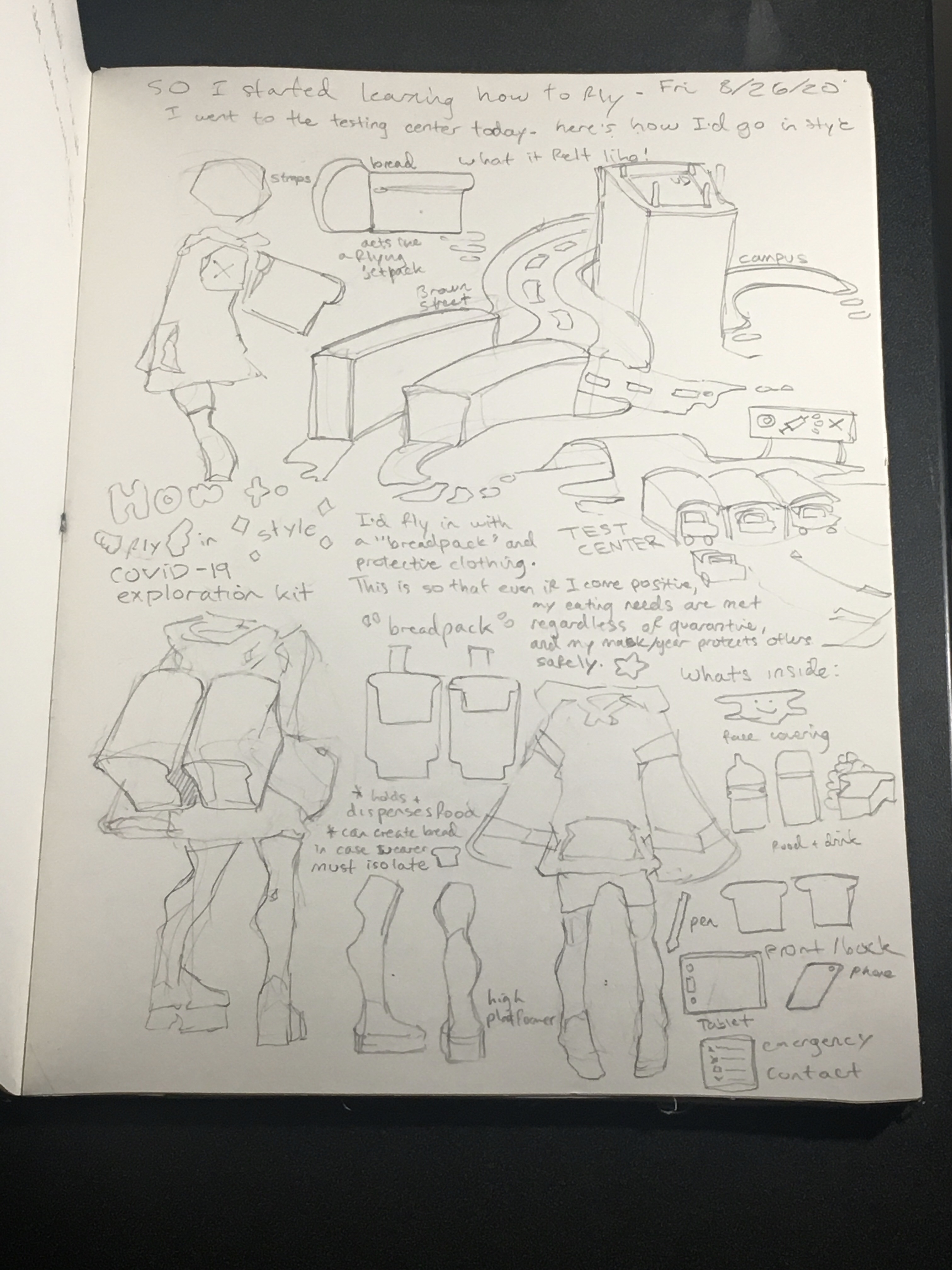
Opening WordPress, mentally fabricated eyes of our entire roster burn on my back for some reason. It’s an imitation that regularly cripples my ability to write transparently, so I want to disclose this now.

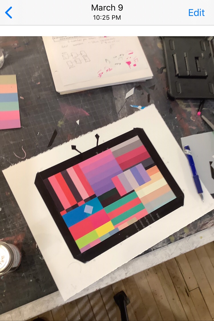
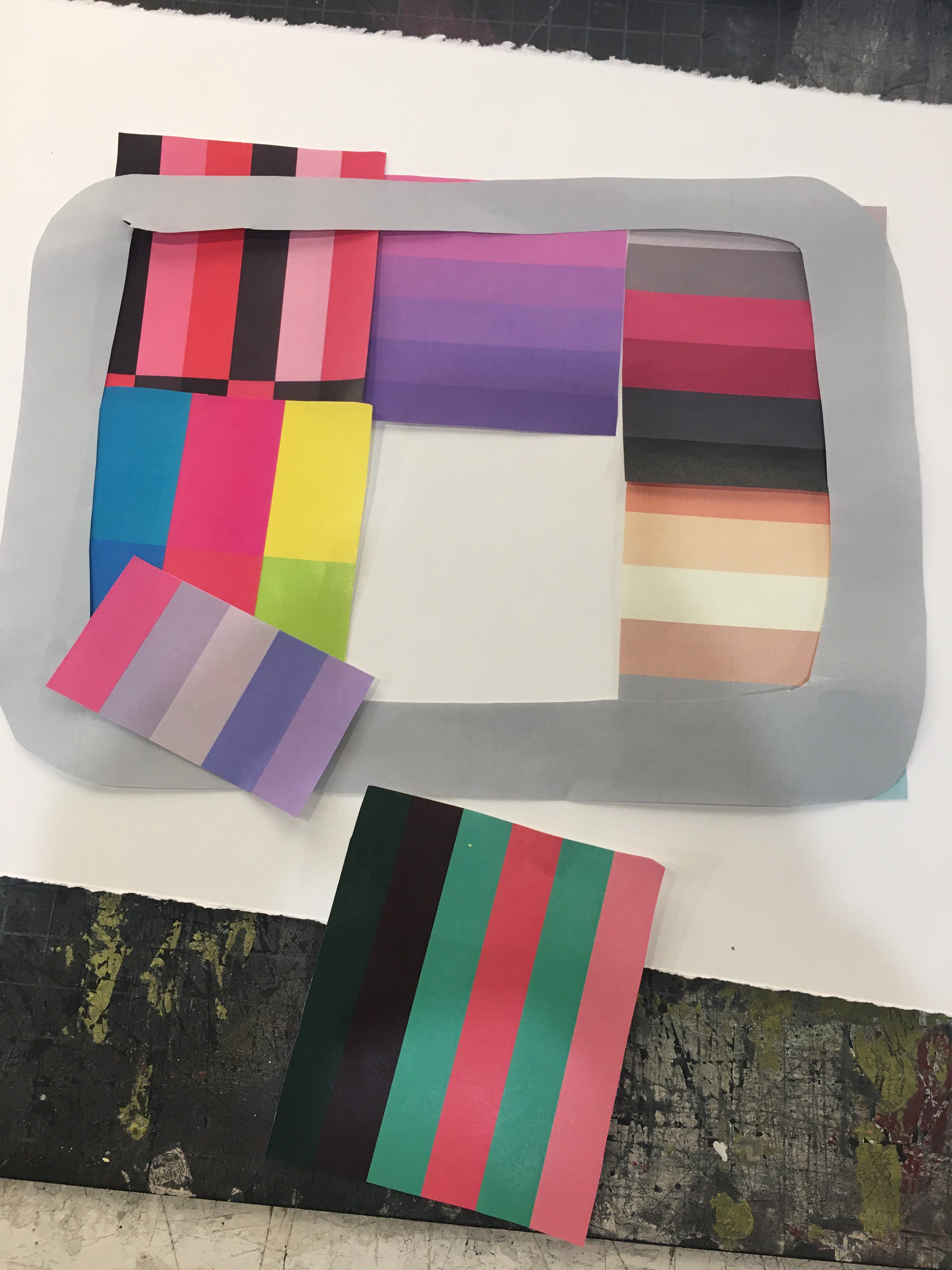
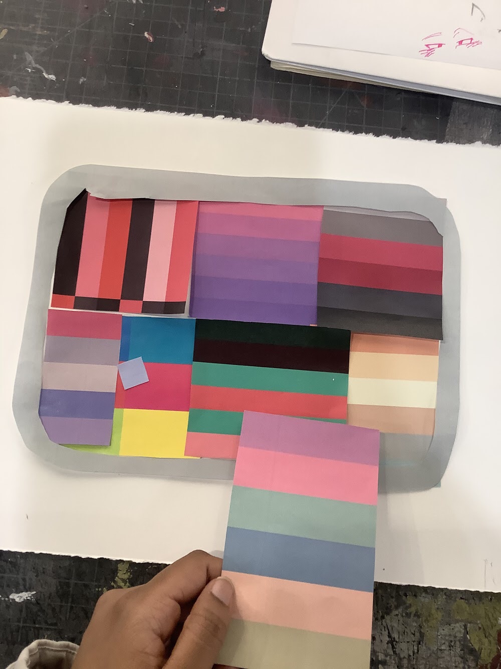
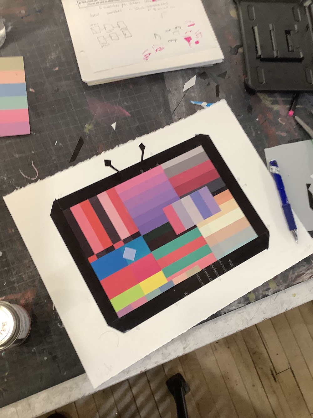
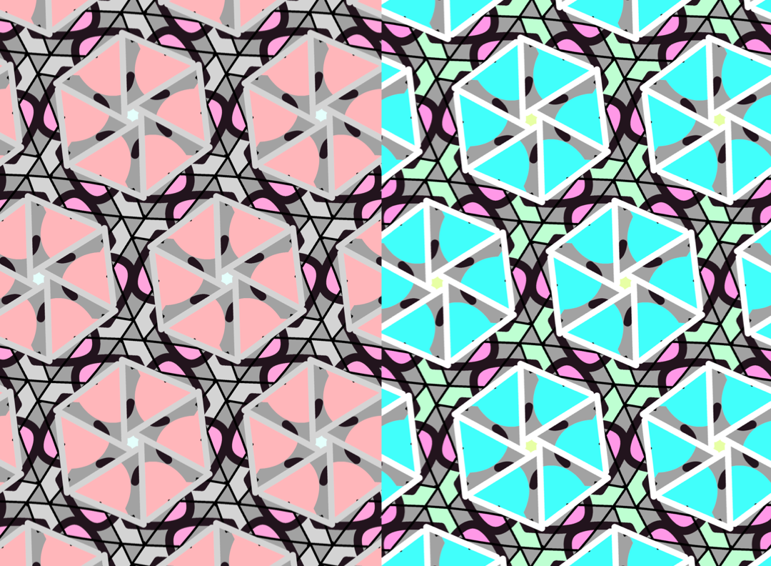
But finding an art piece I like is fun! I draw crisps and patterns and blocky shapes felt within each line drawn. I read lines depending by rhythm, some lines are slower, others read faster to grasp the general crisp form and blocks that make up a hand for example. I enjoy this process especially because it allows me to ruminate on how te artist went about constructing the image, and quite literally building the artwork/object’s shape.

When drawing I reference a myriad of notes on my phone telling me how to ease up and have fun while drawing, especially on my tablet. One of them includes having a favorite artist in mind while building something in particular (a crisp line or set of blocky colors for example) and learning their drive to color/stroke/etc.

For me, blocky shapes calm my reading flow while drawing an image. I hope this makes a bit of sense. In hearing “the cork trick isnmt taught, but learned” I realize resonating with shapes is something i’ve gradually developed over time.

In watching Sinar surf, “getting a feel for something” sounds like a plain, touchless box. I can’t do anything with this information. So in sketching, I explore specifically what amounts of pressure feel fun to add to my page, how exactly should i hold my pencil and when does it feel fun? There’s a lot of physical ticks I pay attention to while drawing. And they’re fluctuant, always bound to change based on what new habits I discover to do next.

“Expectation is the thief of joy,” especially resonates well from Tom’s video. In blocking things down on an image, my expectations to do something “great” in art lessens. Because I’m drawing on my tablet, not giving an opera performance, and my process instead becomes more of enjoying the show.

Watching Tom have every resource in the surfing book redirects to my preparation anxiety I tend to develop especially in instances where I’m prepared. “You have the right items, so you’ll do well,” removes the space I need to be able to comfortably fail. It’s already hard enough to breathe in a world so uncomfortable with error. Even harder when high expectations catch up from behind, a building lump my throat, and there’s little room for me to move or escape.

Tom uses oddly fitting, if not limiting terms to describe Rizal’s surfboarding. “Pro skill. Pro experience. Pro style.” But I’d love to know what “knicks” did Rizal explore to “get such a well feeling” in surfboarding today? Are there pressure points to pay attention to? When and how should I know when to stand or change my board’s angle, in order to best suit the changing waves?

“Rizal and co coached us into loving surfboarding,” is reassuring, because it implies welcoming their learning process with open arms. Puts experimentation and exploring specific aspects of surfing, like figuring out your posture, as part of the fun. I already observed Rizal and co often leaning their bodyweight as part of their board while surfing, which looks fun. Whereas Sarah’s feet at 18:22 barely feel comfortable standing up. Their self built expectations-pressure-could be why. But watching the video I noticed her feet falling gradually flat to the board, which paints her being more comfortable (and happier!) while surfboarding.

1.Sacred space
2.Learn the code
3.He understands
4.Compare and despair
5.Get in the boat
6.Be afraid. Sort of afraid
7.Always be playing
8.Fail with joy
9.Get hurt
10.Persistence

Sometimes I wonder if being affluent is a running wall or block that impedes a person’s learning process. The reassurance of having every right item creates too deep of a cushion, and people lose themselves buried in their abundance before they’re able to grow.

PROJECT 4 artwork + statement

  • Paint Tool Sai
  • AviUtl (main)
  • After Effects
  • Graphic

Song: The Chattering Lack of Common Sense by GHOST

My NARRATIVE is the inability to decide for one’s self. “The Chattering Lack of Common Sense” was used as my backbone to telling a story.

Scale, Line, Order, Motion and Time were used to arrange key frames, animated logos and figures across a screen. Their arrangement to ensure an unsettling presence while listening to the final video. I used custom logos as focal points and things to mainly center on when viewing, as they provide my primary “Warning: check your thoughts. You may lose them,” and if not handled with care, lose yourself.

Visual Hierarchy (layers), Compositional Flow, Focal Point, Psychological Reaction/Interpretation/Solicitation were also used as key visual tactics in my final work.

Project 4 Ideation + Sketches + Brainstorming

Brainstorming / Sketches

In my mix of really “trigger happy” songs with bursts of energy sent through my playlist, my escapism sinks deeper in bed the longer I think about quarantine. I’m thankful to be able to say “I’m fine,” while others just my age lie unsure if they can wake up the next day. A lot of my projects attempt to cover ideas, colors, concepts, illustrations I’ve wanted to make for long periods of time, and in turn bundle together as one major callout to myself. Project 4 reflects my massive inability to decide for myself.

For my final project I want to encompass what roams my mind the most: shapes, logos, signs and warnings. Pictures, people, faces, black and white. Characters, stories, things that resonate deep uncovered parts of my brain and memories. I used a character for this project, who carries a steadily changing “warning” sign as signal for “what to watch out for” and my steadily unravelling thought process in daily life. In being able to decide for myself I end up morphing parts of my identity, posture, voice, feelings, etc around the right people, and this video is a slight cry for help. Probably. My thoughts were also muddies and jumbled when deciding how to make this project.

A lot of varying ideas muddled in cloud like portions during my WIP process. I hadn’t solidified to create an animated video until very late in my process, which in adds in my main reflection on Making Decisions, because a lot of the time I’m afraid to. That best summarizes my time here in quarantine, growing flowers on my bed with a staggering fear of making a wrong decision. It’s why I stay indoors a majority of the time, blend in crowds when not, taking every measure possible to not “mess up.” Scared to feel “tainted” or reach “game over” otherwise.

A lot of my ideas (visual, written, etc) end up vaguely propped or represented as a result. It’s like I can barely get a message out without softening my punches. I want to punch exactly this.

Originally I wanted to use After Effects for editing, but switched to AviUtl last minute for it’s welcoming simplicity and effects that were closer to what I actually wanted.

I actually got the idea to produce a video after watching this. Although my final video is very bare bones and simplified, I’m happy I got to learn a lot of AviUtl as a result! AviUtl is something I aspired to learn how to use for a very long time, so I’m thankful I made the decision to push into it.

Thank you for enabling me to reflect internal corners (of myself, my art, stories and characters) I’ve never touched on before 2D. This is the furthest I’ve explored myself in a very long time.

note: 673 is one of my favorite numbers. It’s randomly chosen and has no meaning aside from jokes I make with it.

CONCEPT+COLOR

Can you spot the outline of a duck?

My working title is “Spot The Duck” within an ominously lit room. A deserted room whose uneasiness immediately leaves once the duck is spotted. Ducks are cute, and holds a nice asymmetrical shape fitting enough for a compelling silhouette. A combination of both eerie and cheery auras solidify as my Spot The Duck concept. In the middle of clearing out my latest dust bunny this quarantine, I spotted an extra coat sooted over my collection of tiny adorable rubber ducks. Cleaning them compelled a small yet laughably fun idea to include ducks as a final art piece. My bare bones concept littered most of my Apple Phone Notes until it summarized the following:

“iPhone in center of dark room. Photograph the space. Facing the door.”

Compiling a set of ducks within a dark room required two things: a somewhat spacious square space and nighttime in Chicago. I could not record my footage in the day, for my blinds would giveaway that my iPhone was used as a screen. The scene is supposed to be ominous, and visible Apple products take this away just slightly. Attached is a video used as source material for glitchy effects and highlights duck silhouettes brightly within an IPhone 6 screen. I love bright, saturated, and boxy bold colors. My affinity to “black + one vibrant color” color schemes bleeds into my final COLOR+DESIGN project. I love vibrant colors, internet, and glitchy tv screens filled with a little too much nostalgia, which hones as my final concept for Spring 2020. What I know about color is it’s unpredictability, especially when compiling colors you think would look together, yet the execution proves otherwise. I know colors can work unexpectedly when coloring art. Two colors may work together when you least expect them. I like cute things (ducks) with really strange, almost dystopian auras surrounding them. This probably reflects my general lifestyle, small yet surrounded by catastrophes in almost everything I see. The video mirrors my messy thought process when designing colors, and that it’s up to me to find out which colors work, and don’t.

Final project for Spring 2020 COLOR + DESIGN by Tash Nelson

4/26 WEEK 5 Color + Design

https://www.phillips.com/detail/MARK-BRADFORD/NY010319/24

  1. Mark Bradford’s work especially resonates for me to explore corners using my eye. I can spend the entire day traveling in paper cut corners, folds, colors and creases used in Bradford’s work. Helter Skelter II was named after a Beatles Song, and was based on the Manson Family cult murders that took place in the late 1960s.

2. A) Fill an entire refrigerator with magnets. Inside the refrigerator too. B) Photograph an entire puzzle piece save for two or three pieces finished. C) Have every light in a room turned off save for an IPad or IPhone. Photograph the space.

3. Images of source material-sketches, photographs, mock-ups, experimentation with materials

Mark Bradford – Helter Skelter II

4/26 Project 4 Work In Progress

I have a character as this project’s main focus. I’d like to make something similar to an animated clip. They’re based on a much larger story I’m working on, but I want to illustrate their setup specifically. With dystopian sci-fi elements. I have some extremely bare bones ficlets about them, which may be this project’s main setup. I’d like to use this as a backbone to depict “coping with isolation” and some existentially numbing thoughts in project 4.

For a visual reference I have the characters attached. I linked example artworks/videos I’d like to use as reference geared towards my end goal/ final work.

https://youtu.be/1ZGvPR-IWWo (main reference)

I’d like to explore things we lose while in quarantine or “coping while in isolation.” What are things we generally lose sight of? What do we then begin to feel (almost as an immediate replacement)? I have several jumble ideas of what to feel during quarantine, how others can feel while sealed in habitable boxes we’re fortunate enough to call “home.” But I’m not exactly sure where to pinpoint or narrow my ideas to one theme. Maybe I could explore what it’s like to write during quarantines, with my general senses of anything (socializing, walking, sensing other people’s presences) are reduced to mud. Maybe I can detail my crippling fears of not doing enough, or feeling bad for laying in bed. Maybe I can write a short story that mirrors what it’s like to live in an abandoned area.

4/19 OP ART

Michael Kidner
  • Their process — Kidner pulls viewers into a meshed collection of two or so colors scattered across an image. The colors are organized to create a blending, almost glitchy effect to the naked eye, in that all of the colors are arranged to create some type of illusory motion in his pieces. The colors look like they’re moving while viewing his work. And the space is completely filled, busy, almost like a static TV colorbox running in the middle of the night.
  • Biographical information — Fine Op Artist from Northamptonshire, England. Widely known in the 1960s as a pioneer in Op Art.
  • Your interpretation of the work — The above images are especially captivating with Kidner’s juxtaposition of vibrant versus graduallly dulling or dark colors. With a blurry view I can see the second image as gradually fading in opacity when reality shows the colorful shapes simply getting thinner and thinner. But I wouldn’t be able to capture this without looking closely. This is likely Kidner’s exploration on shapes versus saturation when working with colors.
  • Your experience looking at the work — the firstmost image is (likely unsurprisingly) my favorite 🙂 I almost want to drop a small silver ball inside the image and imagine it falling through small white passageways, like a labyrinth. The above image gives a glitchy effect I enjoy thoroughly.

Project 3.1 Recap

PROJECT 3.1 MAPPING:

My earlier stages of painting had large, billowy cloud effects in which each piece took roughly 1-3 weeks to finish. These are some of my favorite painterly works to reference from.

PROJECT 3.2 FOUND ACTION:

For Project 3.2, I explored “the found action, motion, and illusion of putting myself inside a digital screen.” How can I visualize my self being immersed in digital media? My largest approach is a mini TV box with vibrant colors projected on its screen, questioning my life choices and intentions. Why do I want to “escape life so badly” and what is it about screens that leave my eyes immersed in virtual zones, worlds, for hours. Maybe it reflects emotions I want to portray but have a hard time doing, decisions I want to make but can hardly make for myself. I used to watch people make decisions on TV and otherwise, and this helped prompt me a little bit in deciding actions for myself.

ARTWORK 1

The first final work consists of a 3D composition to build a mini “TV” with glitch animated effects. The TV itself is made of my phone, a white box, my broken drawing tablet, and a paper with small, alluring symbols marked on it. The goal was to replicate the work animators/cartoonists/major tv channels used to approach in early 2000s toon channels. A lot of them included not only 2D animation, but elements of 3D and creative use of cardboard, figures, costumes, lights, cameras and other amazing effects that allowed viewers to immerse themselves in their world. I used my broken Wacom Cintiq tablet as a background to further emphazise the immersion of an illustrator’s world (and block out the rest of my very messy desk behind it). A broken tablet was used to emphasize the detrimental constructs of being an animator/illustrator/creator and how we very quickly neglect our health for artwork. Mine was neglected the moment 6 year old me turned on the TV and did not learn to turn it off. I learned to draw somewhere in the middle of this. But I ultimately had fun.

ARTWORK 2

The second final work is a light shaped to mimic a portal, or entry. It offers people a separate, paradise-esque world outside of reality. Entering the portal requires one cost, in that file “001_life” can deteriorate and so will their lives. (“Too much of one thing is bad for you” as a working title). I used Graphic to add the portal’s “warning” and Photomosh for additional effects.

My project partially mimics habits I have yet to undo when it comes to balancing my own life. Rewatching a few episodes of Kappa Mikey made me realize just how scary of a degree illustration, 2D work, cartoons, etc form a majority of my life and imagination. Sometimes I wonder if it’s because of my diagnostics and long history of speaking issues (I didn’t speak until I was 4 years old), or that my living circumstances simply didn’t allow the safety of openly going outside and socializing until very recently. My mother always hated when my dad would say “stop acting like a cartoon character” when I was little, as she knew I had a hard time expressing myself physically and then some. I can’t exactly pinpoint it, but seeing so many emotions and exaggerated expressions on screen helped me process mine somehow. Viewing animated 2D work, illustrations, games and whatnot felt relieving(?). Younger me felt happy and could recognize it while watching a screen. I wanted to at least replicate this happiness somehow through the vibrant colors of a TV color box, and this is partly why I chose a glitchy colorbox effect as my “TV screen” made up of an IPhone and parts I could find around the house. I really enjoy vibrant colors.

TL:DR “I joke about toons making up 40% of my life but it might not be a joke actually :,)”

3.2 ARTWORK 1 is the mini “TV” .mov file. I wanted it to capture atmospheric perspective (a lone, vibrant TV screen basked in warm light creates an inviting picture for someone who really likes digital media), a little Figure Ground (large solid black tablet creates a dominating figure that does let eyes easily see a white mini TV box), direction (vibrant color bars on a TV screen glitching haphazardly), and kinesthetic response (the IPhone/ “TV” screen looks like it’s going to fall down, but it doesn’t).

3.2 ARTWORK 2 is the very dark photo of a “CAUTION portal.” I wanted this to capture Overlapping/Figure Ground (very sharp box figure versus opaque black), Transparency (gradually fading shadows within a lighted box), and atmospheric perspective (very ominous setting of a portal). The actual work consists of a very carefully placed IPhone box on a desklamp, followed with precise photo editing to create a dark atmosphere. It was difficult to get my box to balance just right on my lamp and not fall off.

In-progress shots / Mockups

I grew up watching Nicktoons primarily 🙂 + CN and other channels as well
Design a site like this with WordPress.com
Get started