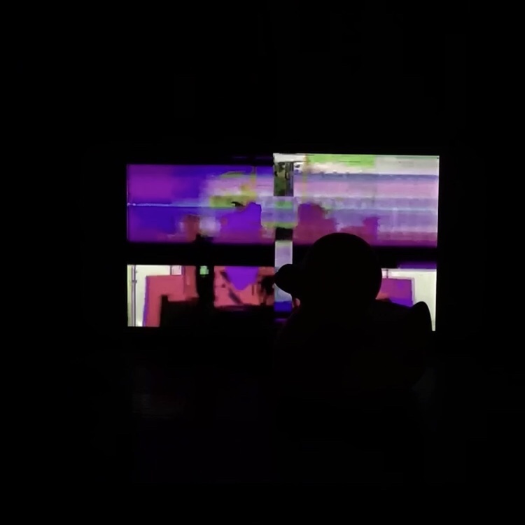
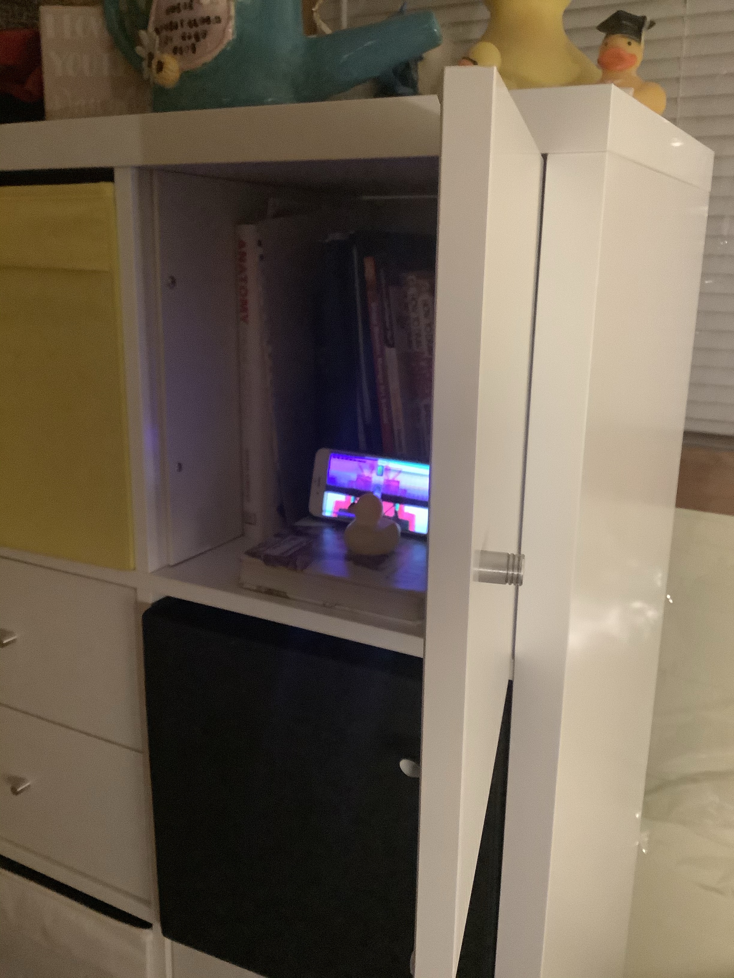
My working title is “Spot The Duck” within an ominously lit room. A deserted room whose uneasiness immediately leaves once the duck is spotted. Ducks are cute, and holds a nice asymmetrical shape fitting enough for a compelling silhouette. A combination of both eerie and cheery auras solidify as my Spot The Duck concept. In the middle of clearing out my latest dust bunny this quarantine, I spotted an extra coat sooted over my collection of tiny adorable rubber ducks. Cleaning them compelled a small yet laughably fun idea to include ducks as a final art piece. My bare bones concept littered most of my Apple Phone Notes until it summarized the following:
“iPhone in center of dark room. Photograph the space. Facing the door.”
Compiling a set of ducks within a dark room required two things: a somewhat spacious square space and nighttime in Chicago. I could not record my footage in the day, for my blinds would giveaway that my iPhone was used as a screen. The scene is supposed to be ominous, and visible Apple products take this away just slightly. Attached is a video used as source material for glitchy effects and highlights duck silhouettes brightly within an IPhone 6 screen. I love bright, saturated, and boxy bold colors. My affinity to “black + one vibrant color” color schemes bleeds into my final COLOR+DESIGN project. I love vibrant colors, internet, and glitchy tv screens filled with a little too much nostalgia, which hones as my final concept for Spring 2020. What I know about color is it’s unpredictability, especially when compiling colors you think would look together, yet the execution proves otherwise. I know colors can work unexpectedly when coloring art. Two colors may work together when you least expect them. I like cute things (ducks) with really strange, almost dystopian auras surrounding them. This probably reflects my general lifestyle, small yet surrounded by catastrophes in almost everything I see. The video mirrors my messy thought process when designing colors, and that it’s up to me to find out which colors work, and don’t.
Final project for Spring 2020 COLOR + DESIGN by Tash Nelson
