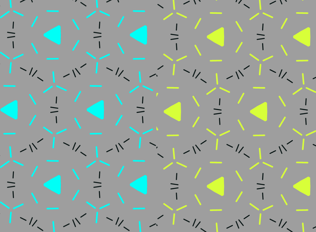
Their process — Kidner pulls viewers into a meshed collection of two or so colors scattered across an image. The colors are organized to create a blending, almost glitchy effect to the naked eye, in that all of the colors are arranged to create some type of illusory motion in his pieces. The colors look like they’re moving while viewing his work. And the space is completely filled, busy, almost like a static TV colorbox running in the middle of the night.
Biographical information — Fine Op Artist from Northamptonshire, England. Widely known in the 1960s as a pioneer in Op Art.
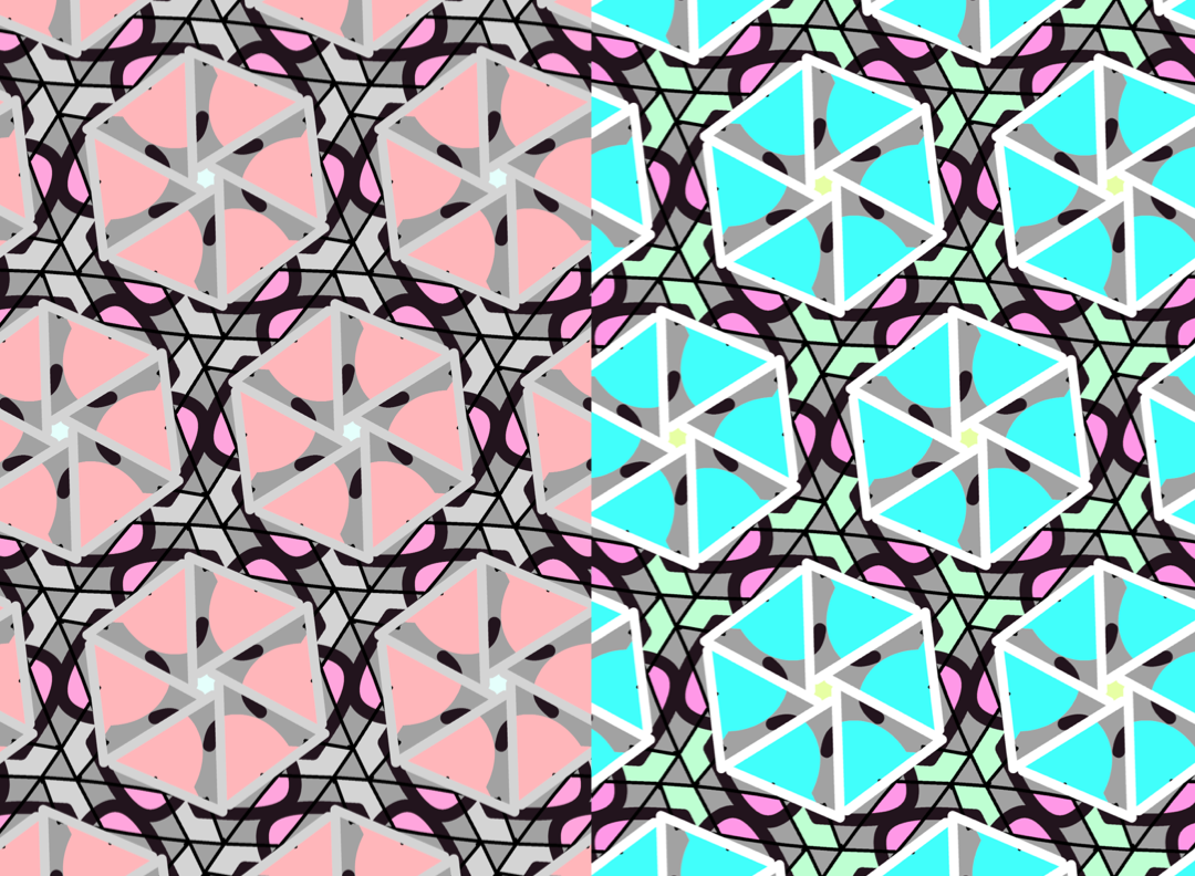
Your interpretation of the work — The above images are especially captivating with Kidner’s juxtaposition of vibrant versus graduallly dulling or dark colors. With a blurry view I can see the second image as gradually fading in opacity when reality shows the colorful shapes simply getting thinner and thinner. But I wouldn’t be able to capture this without looking closely. This is likely Kidner’s exploration on shapes versus saturation when working with colors.
Your experience looking at the work — the firstmost image is (likely unsurprisingly) my favorite 🙂 I almost want to drop a small silver ball inside the image and imagine it falling through small white passageways, like a labyrinth. The above image gives a glitchy effect I enjoy thoroughly.